Learning Objective:
- Data Analytics and Predictive Analytics
- Convert Data into Knowledge
- Cleaning, exploring, visualising data
- Tools and versions
Data/Information/Knowledge
Data - In various forms. Visual, written, audio, video. Data is collection of raw facts and figures. Eg. 100% humidity in Chicago
Knowledge - Domain or derived (raining or going to rain. 24 hours after it rains in Chicago, it will rain in Delhi. ) Profit can be derived only from Knowledge - it is related to dollar, not data or information. - If it rains, sell raincoat and umbrella and make money out of it.
Information - Processed Data is information. (It will rain in Delhi, so necessary arrangement)
Process - very cheap, - We need Domain knowledge and Tools.
Tools - Power BI , Tableu are tools.
Business Intelligence give Data Perspective

Predective Analysis - What if.
What is BI or Business Intelligence?
- Set of methods, processes, architecture, application and technology
- that gathers and transform raw data into meaningful and useful information
- Used to enable more effective strategic, tactical and operational insights and decision making
- Power BI is capable of processing the Data also. Extract-Transform-Load (ETL) capability and make report
- In Tablue ETL capability is only 30% but Visualisation is great. - More useful for presentation and story telling.
- Accelerating and improving decision making
- Optimizing internal business processes
- Getting to know about business past, present and future
- Increasing operational efficiency
- Giving quicker responses to business related queries
- No guess work
- Meeting/Exceeding Manufacturing and Inventory goals
- Gaining Valuable insights into customers behaviour.
- Excel is a tool for data gathering
- Cant add data from different data source in excel and so cant optimise
- Increase operational efficiency

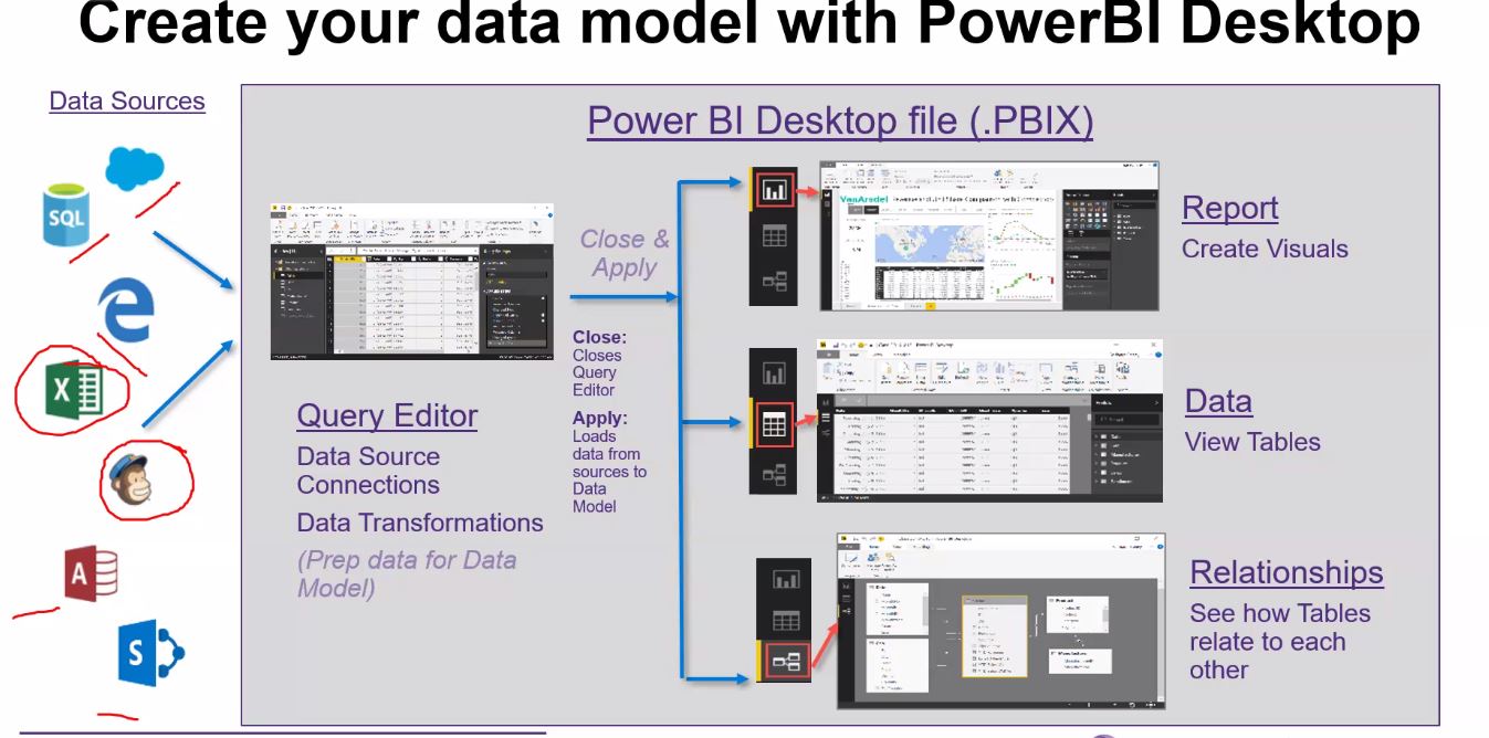
- Access the data - using SQL , CSV, Excel, Web, Folders - Part 1
- Clean up the data - Part 2
- Mash Up the data - Part 2
- Explore the data - Part 3
- Visualize the data - Part 3
- Share the data - Part 4 - Like whats app, others too need to have for right usage.
- Refresh the data - Part 5


This will be saved on your desk top, when you click this, you will find the green screen as below or an yellow screen, This has all tutorial and instructions.


- Home menue data tab - get data
- from the screen
- three drop down - first two leave as it is - third,
- You can load data or transform data - Load when data is clean, transform when something need to be changed (power BI is not importing the data, it is only connecting)
- Way of representing data in power BI - on the right hand side - Table - Numeric, timeline and blank.
- On the LHS we have Report/Data/Model - You can select what you want - data (Is full data not review of data), base data is not changed.

- there is no way to zoom up/down the canvas area; you can drag your graph
- Ctrl Z will reverse the last step here.
- Comparisons - between countries or elements.
- Composition- How these two data points are contributing or helping each other - Pie chart - ratio of population of various countries
- Distribution - Statistical - Sales and Profit.
- Relationship - Growth of Population and growth of GDP

- How many variable do you want to show in a singe chart - Number of columns
- How many data points will you display for each variables - Number of rows
- Will you display values over a period or among items or groups - time factor - change in population, GDP wrt time.

No comments:
Post a Comment